
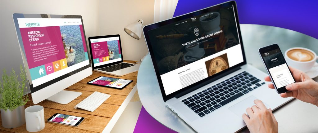
In today’s world, mobile users outnumber PC users and thus, a website is a critical business asset. Organizations aim to create a responsive website design because it is a key solution to our multi-screen challenges. Creating a website or app that adapts its interface based on browser or device is a common practice.
Partnering with a website design and development company can enhance the appearance of your website effortlessly. We have varied devices and screen sizes available in the market and thus, it is difficult to manage the code base for various screens and devices. A responsive web design service will make it easy to access content on any screen size of any device. A website development company will maximize the development speed and boost usability.
In short, a responsive web design will help you in accessing a website across different platforms, browsers, and devices.
Top Website Design Principles
Fluid Layouts
Fluid layouts will help you in adapting to the current viewport width and height. Instead of giving an element a set width, it's common to use the max-width attribute. Employing percentage, viewport height, or viewport width improves flexibility in ways that pixels cannot. So, the next time you're designing a layout, make sure to incorporate these tiny tweaks and start reaping the benefits of responsive design strategies.
Adjustable Images
Images are a top priority while developing the most basic layout. You must always dimension them correctly to ensure that they fit the design. They also don't scale with changes in the viewport by default. As a result, you should utilize percent for image dimensions, as well as the max-width parameter.
Content-Based Segments
It is important for your website design to support the content rather than the other way round. On all screens, media content such as movies and images, as well as text content such as extended and short site copy, should be shown optimally. The use of content-dependent segments instead of device-based ones is the key to responsive web design.
Improving Bitmap Images and Vectors
It is important to have a variety of icons on your website to support the content. You can use the bitmap format if the icons carry extensive details. If your icons are scaling up and down, vector formats are the best choice. Vectors are frequently small but some older browsers may not be able to handle them. They are heavier than bitmaps in some situations, for example, when an image is particularly detailed. Thus, verify the optimization of your bitmap graphics and vectors before putting them online.
Selection of Web Fonts and Systems
Web fonts, add exquisiteness to your website. While creating a responsive website, you will have various options to alter the design via engaging web fonts. It is important for every browser to download each web font. The number of web fonts, the more time it takes to get downloaded. System fonts, on the other hand, are extremely quick. It will fall back to the next font in the font-family stack if the user does not have a designated system font on their local device. As a result, when selecting fonts, keep load time and design demand in mind.
Ignore Hiding Content
Mobile device users are in a hurry to seek different information than desktop users. But that has changed. People utilize mobile devices when commuting, working, socializing, or just sitting on the couch. Increasingly, individuals view the same material on multiple devices. Mobile devices are being used by people all over the world in search of complete material and full access to all services. Instead of hiding material, make sure you manage the layout and breakpoints so it may be presented as readily and naturally as possible.
To Conclude…
Every visitor falls in love deeply with an extraordinary website. A responsive website will enhance business engagement and sales.
Allianze Technologies' competence in flexible web design, combined with its decade of experience in designing online apps has yielded positive results for its clients. We have a bunch of creative web designers and developers on board to serve you with the best results. Our website design solutions are responsive on all modern devices. Our correct blend of brand understanding and technical know-how will build a robust and SEO-friendly responsive website. To know more, reach us at [email protected]